

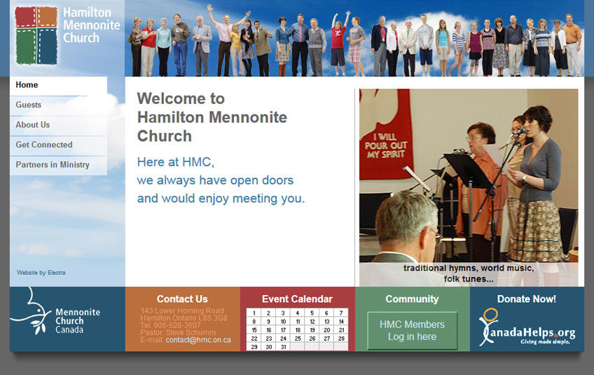
How do you ‘update’ the world’s oldest logo?
When you look at branding a Christian church, you start with great materials—the cross, a fish, a dove—but where do you go from there? The power of these symbols lies in their simplicity, and the faith experience others have had with these symbols.
The Hamilton Mennonite Church, a contemporary urban congregation, asked Electra to re-brand their organization. The new look should indeed be contemporary and urban, but mindful of their roots. Just leave out the buggies and bonnets.
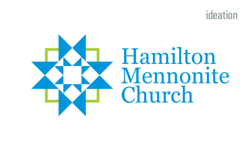
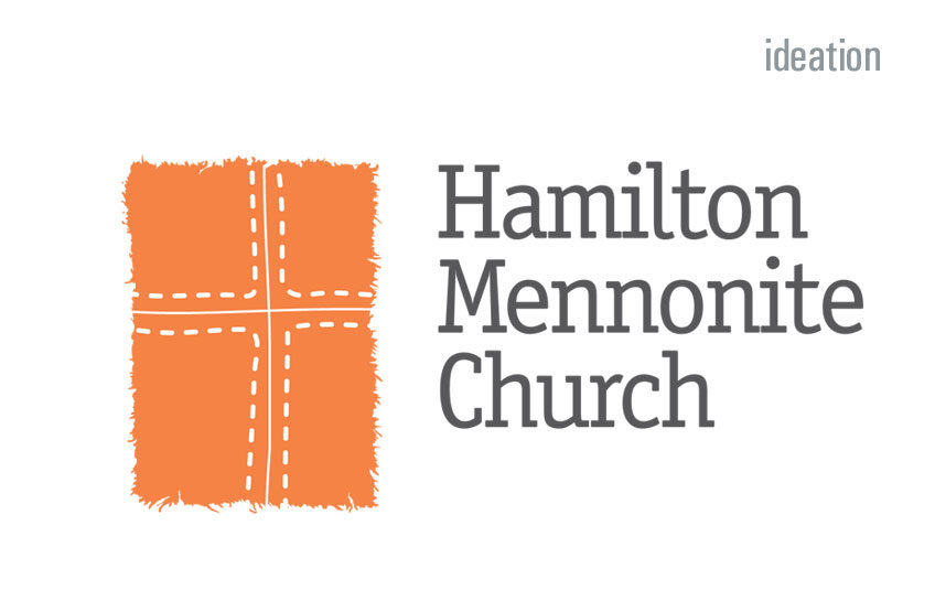
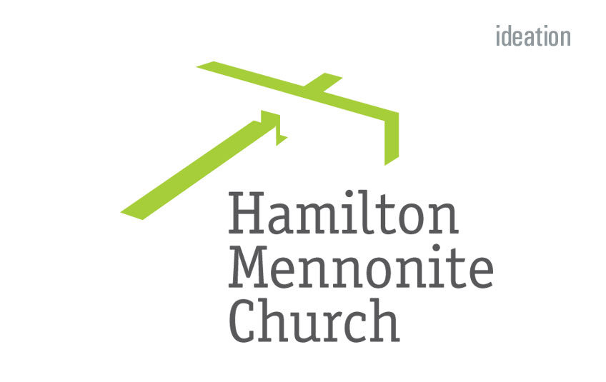
What does the general public think of when they hear the word ‘Mennonite’? Commonly, the historic strengths—barn raising, quilt making, wood working and cabinetry.
We worked with these in mind, and produced a number of potential brand images. The entire congregation voted on the designs, and fortunately, their favourite was our favourite too. And it has remained a fave; Bob drinks his morning coffee from a mug with the Hamilton Mennonite Church brand.
We enjoyed working with the congregation, and used the logo on their new print work and website.


