


Lynwood Charlton Centre
Ontario Prenatal Education
Ontario ACT Association
For Goodness Sake
Grace Hopper had it down.
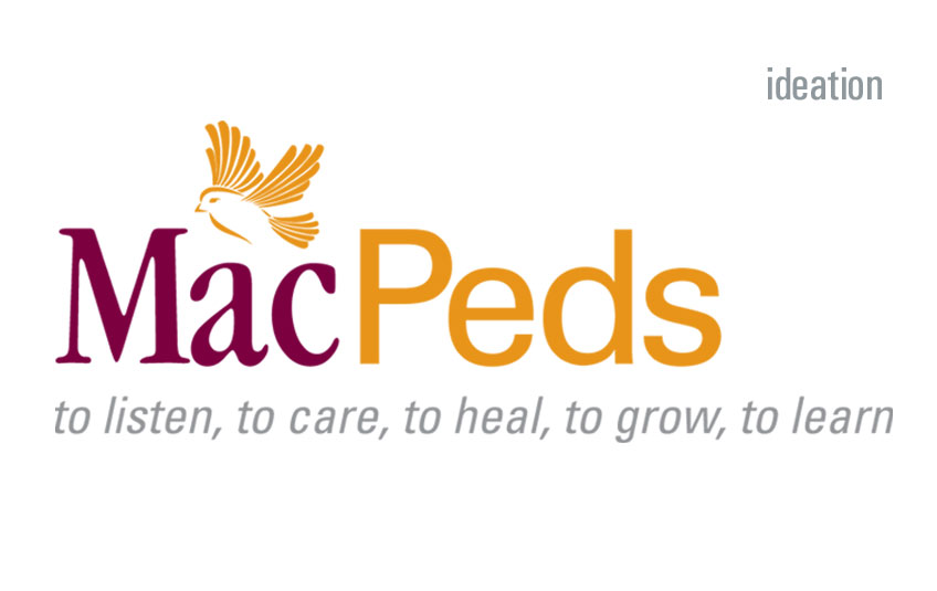
McMaster’s Department of Pediatrics wanted its own distinctive logo, although under the University’s branding guidelines, this was not allowed. That technicality did not hold back the Department Chair, who took Grace Hopper’s famous advice: “It’s easier to ask forgiveness than it is to get permission”.
The Department asked Electra to come up with design approaches that followed the university’s branding guidelines for colour and typography. Permission for use? Let’s worry about that later.
From the beginning, it was determined that:
- The type had to be simple and clear.
- We would use the name ‘MacPeds’, the common name for the Department.
- An simple object should accompany the type.
- A tagline would be part of the brand.
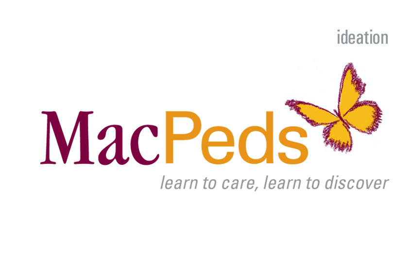
A variety of symbolic objects were discussed—balloons, teddy bears, pinwheels, birds—but butterflies gained the greatest traction. An origami butterfly—a lovely seed for fundraising ideas—became the winning idea.
But, sad to say, this approach did not win approval from the University, who in the words of Naomi Klein, said, “NO LOGO!”